My music magazine ‘R&Beatz’ uses the conventions of most Hip Hop magazines. It includes the typical features of a magazine, such as the masthead, banner, the strap line, main cover line, the cover lines and most importantly the main cover image.
The magazine is called R&Beatz, this name has been decided on as it gives the impression of a Hip Hop/R&B magazine, and this is the type of audience we are trying to attract.
The font, stencil, is used to attract the audience as it stands out and catched the eye. The dominant colours used are grey, white and black.
The magazine has one single main image of a person on a park bench, this is used to give off the impression that he is like everyone else, however the main cover line does says ‘The king is back’. This shows that he is a well known artist, and is used in the same font as the masthead. The word ‘king’ is used and coloured red to show his importance in the music industry.
The background of the music magazine has been cut and replaced with a grey colour to make the masthead and main cover line stand out.
The picture was taken in a park, however was cut out as the emphasis would not have shown on the artist or title of the magazine.
The main artist is sat to show relaxation. It is a natural shot taken so the audience can already feel they like and relate to him. He is the central and only figure of the magazine, although the cover lines also name well known and famous artists for those who read the magazine.
The magazine uses basic colours such as grey, white and black. This is done to make the main cover line of ‘king’ stand out. The magazine is showing the return of someone well known in the music industry.
There is the promotional offer of a free CD. This is done also to entice the readers as they are receiving a free cd of a well known DJ.
The location and artist used helps promote the streets, as it is a basic picture of the artist somewhere everyone has been to.
He is wearing casual clothes and a hat, which helps promote fashion in the magazine.
He is staring at the page and sitting as he would if he was with friends, again showing his relaxed look.
The audience would be a mainly 16 – 25 year olds, as the magazine promotes young artists, however older readers can also find artist which they can relate to. Younger readers may also find this magazine interesting as they may find this as their starting point to Hip Hop, R&B and urban music.
The magazine is aimed at both genders; however it may mainly be read by young males, as it does promote new artists who they can relate to.
It is aimed all races and cultures, the main audience being people into urban music.
It attracts audience’s by the use of informal language, the music genre and the simplicity of the magazine.
It has been designed this way to show that although the magazine features many atists, the main artist is the most important as they are on a comeback, and the simplicity and wording is used to show this.
The magazine would be published by a independent publisher, to show the exclusiveness of the magazine.
The use of Photoshop helped cut and paste the front cover and make the cover seem more real and help it stand out. Making the cover helped me learn how to use Photoshop and Apple Macs
If I were to do another front cover, I would spend more time editing the background and use of more text to fill spaces.
Friday, 17 October 2008
Tahmina magazine evaluation
My music magazine represents the rnb culture worldwide. Focusing mainly on young adults. The edition I have chosen to do is the autumn edition, my magazine shows this off because the main colour, which has been used, is orange to give people a better idea. The other two colours, which have been used, are blue and white. The font is written in bold so it catches the writers attention, there are small sub-headings showing what else is featured in the magazine. I chose to use someone from my year in college to model for me to give it a more youth kind of feeling. It is written in a street type of font to make it feel more rnb n hip-hop like. The language is formal and there are quite a few promotional offers up for grabs. The 1 major offer is winning a $1000 dollar shopping spree in New York for one special RnBeatz reader. The other promotional offer is winning some signed cd's by recording artist Nathan. The body language the magazine is trying to portray is a laid back and relaxed kind of feeling.
My music magazine cover represent the RnB/hip-hop kind of theme mainly because of the person I chose to use and basically on how they were dressed. I chose to use someone that was in my age group because it gives it more of that young generation feel to it.At first my picture was taken in the streets but I chose to cut him out and put him on a plain black background.
The media institution that might distribute my magazine is emap because it consists of great conventions such as colour, pictures offers and price rates. The audience for my magazine cover are young adults and teenagers that consist of the age group 14-24.
The way I attracted my audience is by using large fonts and standard colloquial English so people of all ages understand. The genre is RnB and hip-hop. The contents consist of interviews with certain famous rnb stars from London like taio cruz and one of Americas biggest male artist Chris brown.
from this process i have learnt how to use this apple mac computer and the ways of editing and using pictures in adobe photoshop. Also how to capture good images in different angles and sizes and being able to edit them.
If i was to make another cover I would take a lot more pictures and compare them to see which one suits the cover the best and also plan out my work a lot more precisely and in advance so when it comes to making the actual magazine cover it will be a much quicker process.
Magazine Evaluation
Magazine Evaluation
The magazine, which I have created it, has conventions of a real music magazine because it has the master-head at the top of the magazine, which represents the magazine. And that exact master-head would be placed on every issue that is distributed. Also on the front cover I have information about some features that will be included inside the magazine and that is a generic convention, which is placed, on music magazine also on any magazine. I also have promotions to win tickets to a music event, this is a special offer and this definitely would attract buyers. Plus normally the person on the front cover is the main person who is included in the magazine doing an interview on their success, new songs and albums. This normally means there representing that issue and this is related to real music magazines also.
This music magazine cover represents certain social groups. The social groups that this magazine is for are younger people from the age of 14 and over because the model on the front on the cover is young. Plus also if you look close at other kind of things like the big earrings and rings plus the hooded jacket it resembles the streets.
The type of distribution I would want for my magazine is the WWMD. The reason why I would want the WWMD to distribute my magazine is because it’s a joint venture business owned by the major UK news wholesalers. Also because the WWMD continues to grow and evolve and they supply specialist outlets and other distributors
The audiences for this music magazine cover are people from ages 14 and over. And the target audience of this music magazine cover are people who listen to street/underground music. The magazine cover also shows this because, if you look at the surrounding of where the model is you would be able to see that it’s not in a photography studio, but instead he’s sitting on the stairs on the streets. This results to the streets. And the target audience would notice this and think that this is my type of magazine.
I’ve attracted and addressed the audience by the scripture that has been written on the front cover of the music magazine such as the “Upcoming Artists” in which younger people would notice the artists which have been mentioned and would like/want to know what new things they are working on e.g. album or what collaborations they have in the future.
What I have learnt about the technological side of constructing a magazine is that it’s not as easy as people may think. With the way you may have to cut images so it makes that the picture is behind the text. Plus you have to think about your target audience so in that process you have to think of how you going to make it look for it to be suitable for your target audience. This involves colour, fashion style and background images whether you going to have a plain back which has been taken in a professional photography studio or whether you are going to use outside or indoor environments to construct.
If I was to make another front cover the things that I would do next time is take the picture of the model in front off a plane background so it can be cut out easy and I can place the master head behind the model. Or I would have a better environment/background that looks more run down to contrast the streets a lot more. I think that it would be better if an added a lot more information on the front to attract more customers.
By Nathan Gallimore
Tuesday, 14 October 2008
evaluation 2
firstly,the name of the magazine "GAGE" means to take something (in urban slang),and in this case you'll be taking the magazine to read. Then i used two young,successful and very popular artist at the moment to entice my targeted audience into buying or wanting to read it. The issues on the cover of the magazine are representative of the youth of today as all of them concern them.(especially the article on "the rise in gun & knife crime).
evaluation
My music magazine uses current topics in the media and combines the medias view with my personal views and knowledge of youth interests to create a magazine that is truthful,urban and catchy.
Friday, 10 October 2008
Magazine Evaluation
For my media magazine, we decided to choose a hip hop/ r'n'b music genre, called 'GAGE'. My magazine reflects the conventions of real music magazines because the contexts contains subjects which the real target audience would be interested in. My magazine front cover represents certain social groups because it combines all the popular music genres and artists into one magazine. For example, 'Bashy' from the underground grime scene, and 'Chris Brown' from the r'n'b scene. Because of the diverse content, there is a wider target audience for the magazine.
Also, my magazine mirrors real music magazines because of promotional offers such as the chance to 'win a free Bashy mixtape' ,costume and layout design. The costume of the main image is modern, since the girl is wearing a fashionable winter jacket and anchors the fact that my magazine is the winter edition. She also has a fashionable haircut and posesses a trendy look. This suggests that to the audience that the magazine is 'hip'.
The target audience for 'GAGE' magazine is young adults aged 14-21. This is a rather large audience because the music featured is popular amongst those age groups. Although there is a vast target audience for age, there is also a large target audience for race and gender. Since the music consist of mainly urban and r 'n' b, there is a large majority of black orietnated artist, therefore the stereotypical audience would be mainly black people youths. However this does not mean that only black people can read the magazine. The magazine also highlight other cultures in addition to black culture.
The use of language, colour, title and contents all affect the magazines attractiveness/appeal. Firstly, the front cover star is a beautiful young female artist (Danii). This appeals to the readers because girls who see the star on the cover may want to read more about her and look like her, therefore persuades people to buy the magazines. The male gender may see a pretty girl on the cover and appeal to her because of physical attraction, and by purchasing the magazine allows them to see more of her pictures and become closer to the artist. The layuout of the front cover also anchors the magazines appeal. The main colour theme is blue and white because it is the winder edition of the magazine, by using cold colours gives the impression of coldness. Content of 'GAGE' is also alluring because they are things youths of the 21st century would be interested in, for example an 'Exclusive interview with Chris Brown and Rihanna'. These two artists are extremely sucessful therefore an 'exclusive' interview with them suggests that only 'GAGE' magazine has new information about the two artists.
Throughout the process of constructing the magazine cover, I have learnt numerous technological techniques from Photoshop and Apple Mac. I have learnt to merge images together, insert images from the internet on the Apple Mac, extract unwanted parts from the images. change font styles and textures and many more. In addition I have developed the importancy of a clear layout and ways to make the cover look professional.
If to make another front cover, I would change the font colour becasue some were too light and difficult to read. Other than that, there is not much I would do to alter the magazine.
As Magazine Evalution
My magazine uses the layout of a real magazine because it has the main feature of the magazine shown in the background image of the magazine that is where the main focus of the reader should be. It is the image that draws the readers attention and persuades them to buy the magazine. the magazine will be competing with all other magazines on the shelf to get the shoppers attention, so the most eye catching magazine will win. Also like normal magazine layouts it has the barcode, issue number, edition and the price. My magazine uses a bright Pink/Red colour as the background so it is vibrant and peoples eyes are drawn towards it.
It has a few of the sub-features of the magazine briefly noted on the front, around the main image and under the main feature, like that of a typical magazine.
As my magazine is a Valentines day edition the cover stars are in an embrace and looking happy, smiling at the camera. they reflect the genre of music through the clothes they wear and their overall aura.
My magazine is based on the genre of slow jams this includes artists such as Rhianna, Chris brown, Dj Ironik etc. These artists are mainly based at teenagers and young adults in their twenties, so that is who my magazine is trying to attract, to buy the magazine.
The audience for my magazine cover would be the people who listen to the music featured in the magazine, so young adults and teenagers of both genders.
I have addressed and attracted the audience by making the magazine a bright cover (pink) and having the titles in white so it stands out against the pink background, also the title is very big so it can not be missed on the store shelf, and attracts peoples eyes towards it, therefore having more chance of being bought.
I have learnt a lot about Photoshop because before this project i did not have any understanding of how it works, so i have learnt all about the layers, how to produce a background and effects, how to change text size, colour and style. I have also learned all about layers on photoshop and everything else about it. Also before this project, i have only ever used and apple mac once so i was still a little unsure about it, yet now i feel i can use it with confidence.
If i was to make another magazine cover i would make keep the colout the background colour the same as it is bright and eyecatching, and the black and the greyscale image also works, yet i may change the font of the feature articles and also the effect of them because it is not that clear to read. The masthead of the magazine is good because it stands out and the effect gives it a bold look.
If i was to make another magazine cover i would make keep the colout the background colour the same as it is bright and eyecatching, and the black and the greyscale image also works, yet i may change the font of the feature articles and also the effect of them because it is not that clear to read. The masthead of the magazine is good because it stands out and the effect gives it a bold look.
Friday, 26 September 2008
AS Media Studies - (Nathan, Kaher, Kirsty, Maria, Basker
Today in my group we discussed what kind of target audience we will be targeting. Are magazine is going to be targeted at both genders (boys/girls). its headed at everyone its not going to be put into a particular ethnic category therefore its very diverse. Since this is going to be a music magazine its going to be about the music industry. its talking about the urban music scene, readable for ages 14-25. its mostly for the youths off todays generation
AS Music Magazine
In media, we are making the front cover of a music magazine. For our magazine we are focusing on a mixture of urban, slowjamz, hip-hop and RnB, this would be artists such as three 6 mafia, Rihanna, Chris Brown, Fabolous, Lil Wayne and Ne-Yo.  Chris Brown.
The name we have chosen to call our magazine is "Gage". We have chosen this name because it is a shortened version of the word engage, which is what the magazine is trying to do with its readers.
We each have to design our own cover, and for a unique style we are doing one edition from Summer, one from Winter, one from Autumn, one from Spring and a special edition one - the one i am doing, and the it will be a Valentines day edition.
The magazine is intended for Students and Young adults from the ages 14-21, with a trendy lifestyle, the kind of people who enjoy listening to music, and are keen to find out the next big hit, in the genre of music we are basing our magazine on. because it is for students who have not yet settled into a proper full time job, we are pricing the magazine at £2.10, which is both affordable and reasonable.
AS Music Magazine
For our media magazine, we have decided to produce a music magazine with a combination or urban, slowjamz, hip hop and RnB. Due to the fact that the magazine genre is music, we have come to a conclusion that the title is 'GAGE'. This is because 'GAGE' comes from the word engage- which we intend for the readers to be engaged to the magazine and music. Since we had to produce a magazine cover each, we chose to do four different representatives of each season, summer, spring, autumn winter and a special addition (5th member). The magazine is priced at £2.10 which we think is a reasonable price for a monthly magazine, aimed at young adults aged 14-21 with a trendy lifestyle. We intend for the magazine to be 'hip' which many people can relate to.
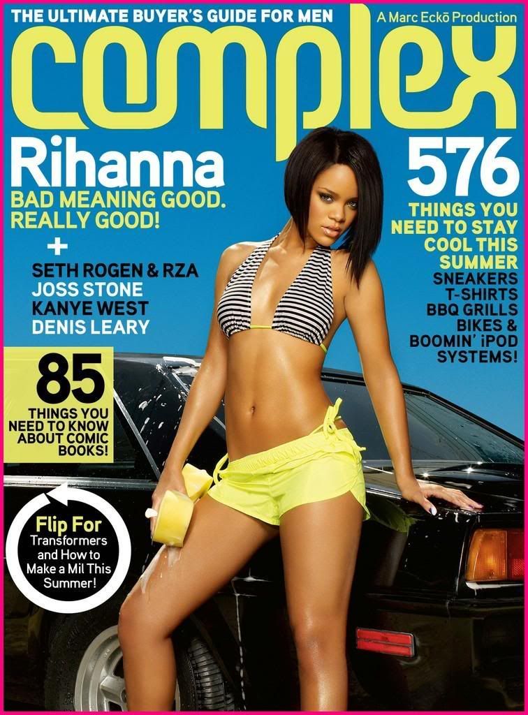
An example of a hip hop magazine featuring rap star T.I
As Media Studies- (Kaher, Baska, Maria, Kirsty, Nathan)
In today's lesson we all discussed what our magazine is going to consist of. The music magazine has different types of criteria. For example; Age groups, Gender etc. We also learnt that composing the masthead, cover line etc, is vital in engaging the audience to read the magazine.

After sorting ourselves into groups, we all discussed what our magazine was going to consist of. So this included the name, which is called 'GAGE', and we talked about the selling price. During the lesson we went out and took pictures for the cover, and started working on the cover using photoshop.
as music magazine
Basically planning out what our group will be doing and how, by looking at other music magazine we got a basic idea of how our own magazine cover will look like. We decided that our magazine genre will be slow jamz/ urban music for example RnB. Later we discussed other areas of the cover like where the barcode will be placed and what the title will be and how large the masthead will be. All the factors of the cover has been discussed but not confirmed. It was then decided that we'll shoot the pictures for the main image on another date. the title of the magazine at the moment was soppose to be ''gage'' however the teacher said it ment something controversal so we had to change it and yet havn't decided the title.
the magazine will be split up into seasons but will always feature a main artist or a attractive woman. reasons for this is because gilrs look and compare to other girls and guys like looking at girls so this way it'll hook in both genders.
Subscribe to:
Comments (Atom)